When considering design changes to optimise your content, think about using each of the visual elements tactically and the priority these should be in based on order of importance to the objective.
The following considerations should be made when optimising visual elements in your content:
When optimising specific visual elements this will invariably have a relative impact on the saliency score of all visual elements within the page.
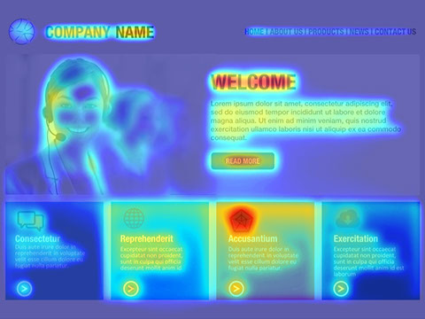
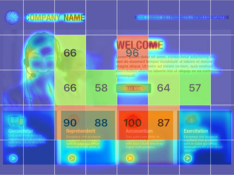
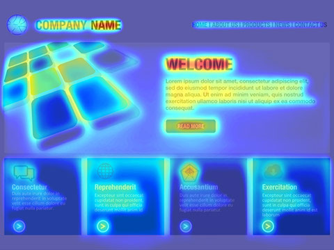
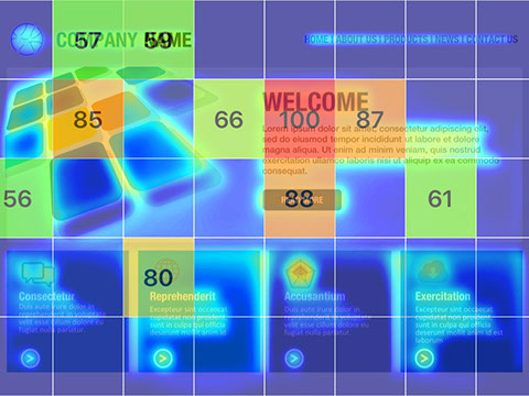
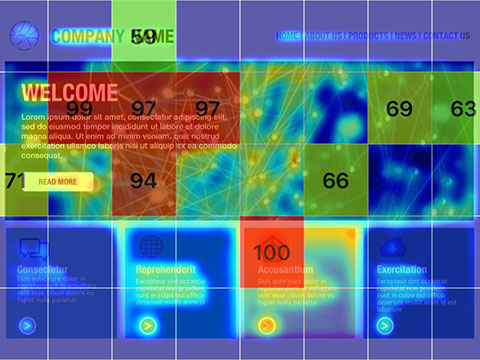
Please find below a dummy web page we have created which shows how using some of the considerations listed above can shift the saliency and attention of visual elements across the page. Each image contains the original image, heat map visualisation and visual metrics - simply swipe or select the arrows to browse between the visualisations.
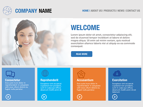
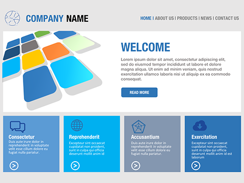
The following dummy website comprises of basic elements such as company logo, navigation, hero section and additional promo sections towards the bottom of the page. The high saliency areas focus around the 'Welcome' heading, accompanying hero image and a specific promo section.
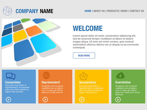
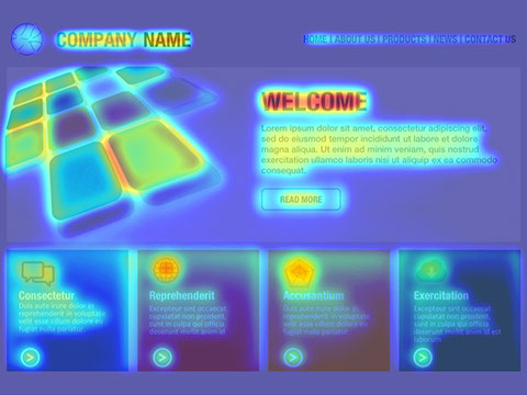
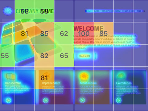
We have made a simple tweak to the formatting of the 'READ MORE' call to action button by inverting the colours. This provides a much stronger edge contrast against the white background, thereby increasing the overall saliency and attention.
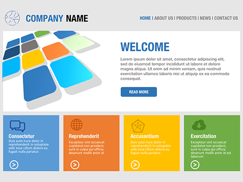
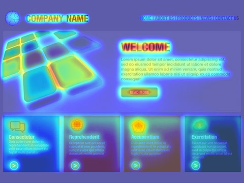
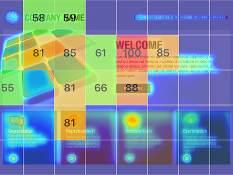
Use of colour can play a critical role in differentiating elements individually and collectively across the entire content. By changing the palette of the bottom promo sections we can see this hasn't affected the saliency too much but it has reduced the saliency of some of the squares in the illustration which can be an unnecessary distraction.
Use of the background imagery can significantly shift saliency areas. In the example below we can see the use of the background image has not only shifted the high saliency area but also increased the saliency of one of the bottom promo sections.
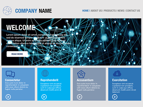
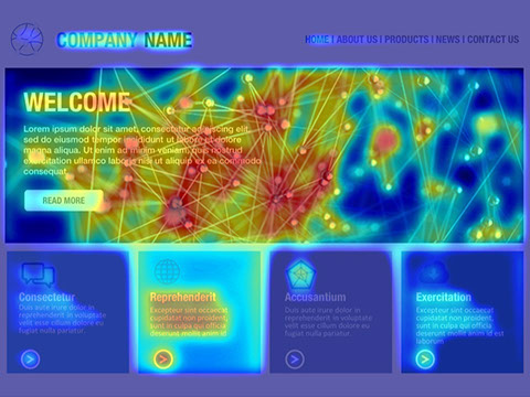
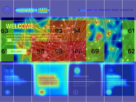
Simple tweaks such as masking the image can help to reduce the contrast and saliency of visual elements within the image. This can also help other elements such as the headings, copy and the call to action button stand out. We can also see that the saliency of the promo section has increased even further.
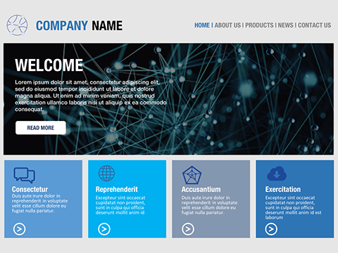
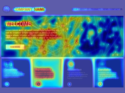
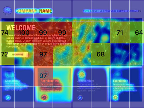
The example below demonstrates the use of accent colours to highlight specific elements. We can see when used efficiently it can help increase saliency and attention.
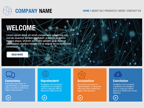
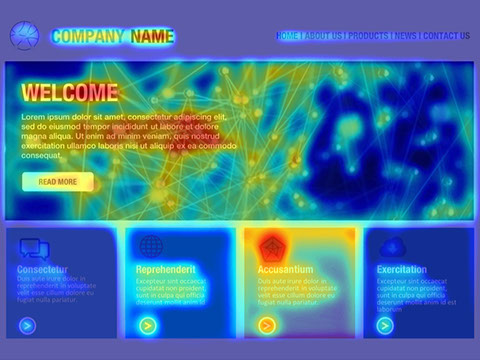
Use of lifestyle type imagery can help provide context and appeal, but it can also potentially introduce unnecessary distraction and divert attention from priority elements.
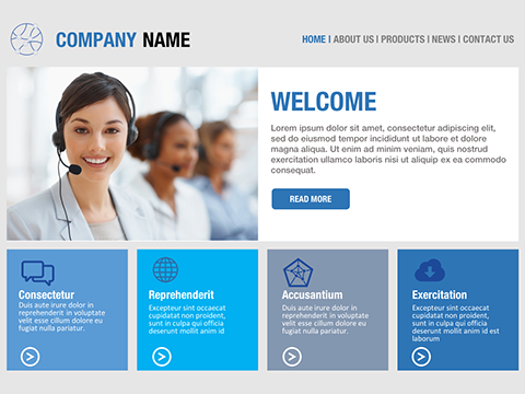
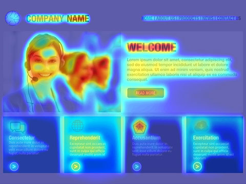
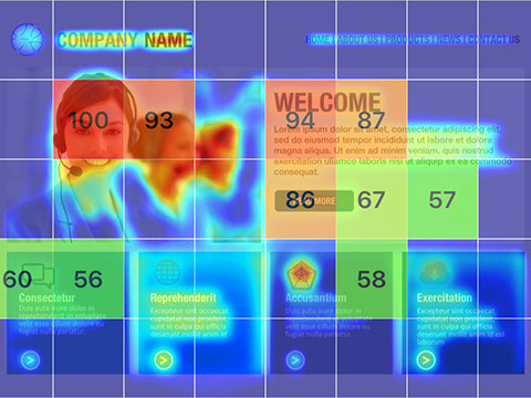
Once again we can de-prioritise and lower the saliency of the image by masking off elements within the image